Flexible Layouts
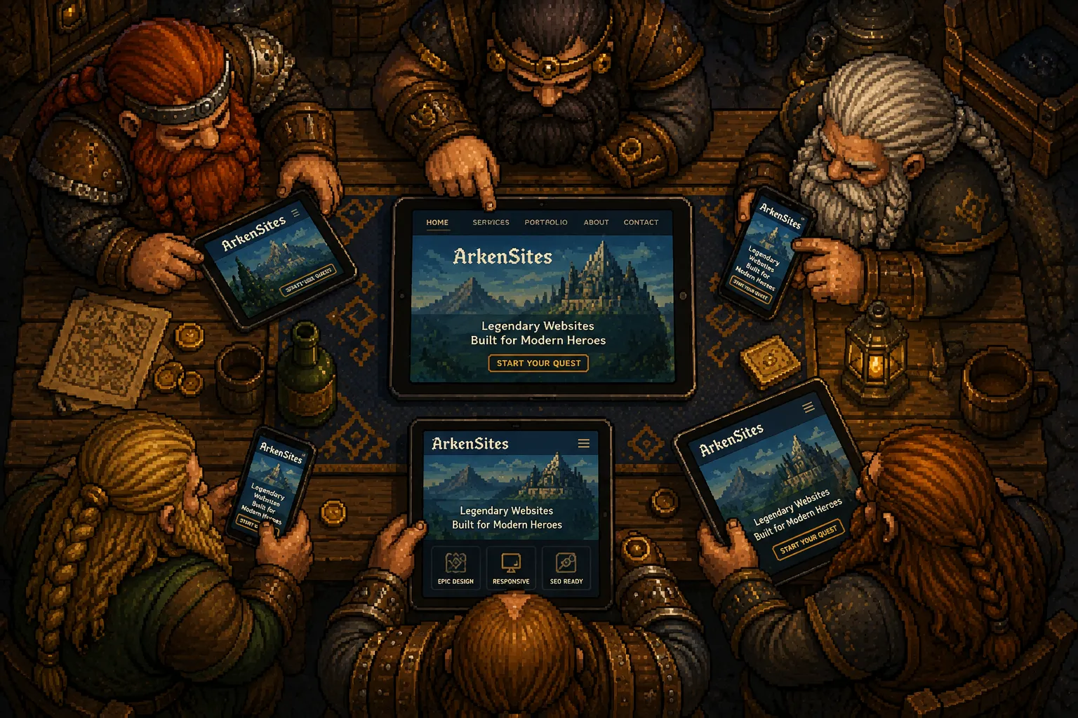
We build our sections with every feature (buttons, text blocks, image sections) they might need already in them, so one can be dropped into a new design and simply work. They’re also all laid out in ten different screen widths from 400 pixels wide for a small phone up to 2000 pixels wide for a larger desktop monitor. This gives us an enormous amount of freedom when laying out website pages, and it helps each website feel unique and work well.
Media Queries
In programming, we use something known as media queries to apply specific styles or changes based on a device or environment’s characteristics. A media query is a rule that says "when the screen is this wide, do this instead." If an element needs to be capped at 250 pixels on the smallest phones and step up from there, that’s one rule, and it holds everywhere that element gets used. Because all ten of our screen widths are named and defined in one place, every section changes at the same points instead of each one guessing where to break. That’s what keeps the code clean and keeps your site behaving the same way from one device to the next.
Responsive Content
How well your site reads comes down to two things: whether the text is legible and on topic, and whether or not the images are worth looking at. On our end, we make sure the fonts used on your site stand out well, have enough weight and contrast with the background, and are on brand to ensure they’re legible and consistent. For photos, our system makes as many as six smaller versions to help with the different screen sizes they may be viewed on. Also, your JPEGs and PNGs each get a lighter WebP copy that is used to help keep pages loading quickly.
This allows you to create the content you need free of any concern that it might not be presented well. You still need to cater your content to your audience, keep it short and to the point, and make sure it’s original, but on our end we go above and beyond to make sure the magic happens that makes all of your content look amazing.